
LiveLib - "My Books and Shelves" feature redesign
LiveLib is the largest digital service for the book lovers in Russia with 5 million daily users
UX/UI Designer
My Role
Tags
UX Research, UI, Mobile
Results
"My Books and Shelves" navigation redesign
The Challenge
Livelib was launched in 2007, since then, it has been raised up to the app with a huge number of diverse activities and an ocean of content (mostly UGC but not only). This fact led to a highly controversial user experience for brand-new iOS/ Android app users. As an outcome, the retention rate leaves much to be desired.
Project Kickoff
My team started with the initial meeting with the Livelib Product Manager who shared with us the design brief and the recent research report that showed 43% of new mobile users had difficulties navigating through the app and finding the features they expected. Moreover, 53% of new users mistakenly believed that they could buy or download books from the app.
Objectives
- Reconsider the app navigation in the perspective to design the clearly usable navigation patterns. This case presents the details for the "My Books and Shelves" navigation redesign.
- Design the onboarding feature that could ease the way of becoming familiar with key LiveLib activities for new users
Research
My team conducted 13 qualitative user interviews with Livelib new users (using the app less than a month). It allowed us to gain useful insights into why new users experience difficulties in navigating through the list of saved books and playing with its key activities such as book search, adding books into the library, creating customized bookshelves, and finding personal reading recommendations.
Research Insights
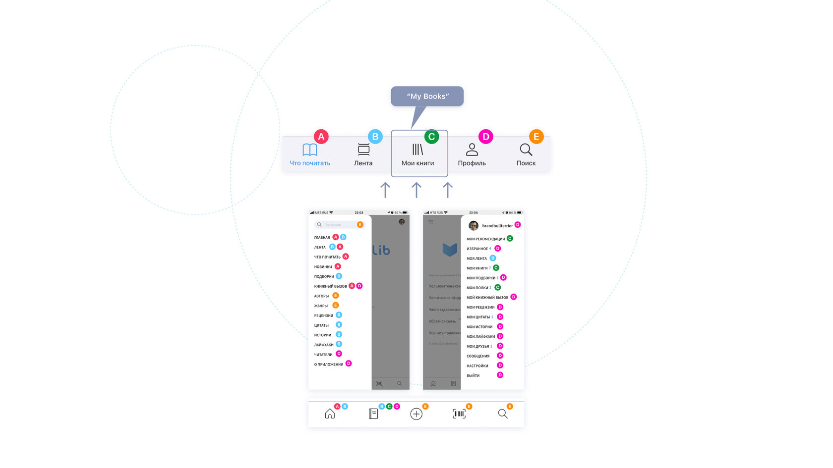
(1) Activities related to the "My books and Shelves" scenario are scattered across the numerous menus where it is not easy to find the desired activity
(2) Tab menu where users expect to find their bookshelves and all books-related content contains a lot of irrelative functions such as profile picture, friends list, and many other activities. However, the expected key activities - the ability to create a shelf and add new books to the personal library are not present
(3)"Add a book to the bookshelf" flow is overcomplicated and overfilled with secondary actions that don't allow users to finish the desired action sucessfully
Information architecture
Navigation architecture has been reconsidered from the perspective of its simplification and clarification by applying the progressive disclosure pattern.

UI Approach
- Since Livelib has more than 15 years of history, with all respect, we carefully kept the visual style familiar to users and enhanced it with native interaction patterns and simple illustrations. It made all visual components work better with each other.
- Mentioning the trend to cross-platform UI patterns, we built the interface using the Human interface guidelines as a basis but keeping the cross-platform approach, adding some Material design patterns where needed
- Progressive content disclosure became our key-focus
"My Books" main screen was redesigned to give users a quick visual clue of all books-related activities available in the app.
Default books statuses are available even if there is no other content added. Quick actions are added so that users could start building their library. See how users can create their personal bookshelves.
Default books statuses are available even if there is no other content added. Quick actions are added so that users could start building their library. See how users can create their personal bookshelves.
"Add Book" scenario now allows adding books to a certain default status as well as directly to a shelf. All secondary book-related actions were moved to a separate third-level menu so that users could focus on the desired action - add a book. See how users can add a book to one of their collections.
Thanks for watching!
Let's work together and make your product better!


© Made with love by Elena Kvasova. All rights reserved.
